Contact Us

Contact Us
Guangzhou Huaisheng Packaging Co.,Ltd.
We provide customers with quality products and provide high-quality services.
If you would like to leave us a comment please go to contact us
+86-18122240089


Color psychology has been widely used in marketing and branding, especially in packaging design, because color can affect consumers' emotions and perceptions of products and brands.
When the color of the packaging matches the personality of the product or brand, this packaging can attract more customers. Successful color matching in packaging can also make consumers immediately associate with the iconic color when referring to a certain brand.
Color is not only a product visual symbol to attract consumers, but also a gentle and powerful emotional marketing weapon to convey brand information and impress consumers.
Today, I will learn the most practical packaging color-matching skills with you~
Kazakhstan's Premium Beer
In terms of color selection, the designer chose black, green, and red with high saturation and low lightness as the main colors. These three colors are closely connected with the culture of Kazakhstan and the brand.
According to the similarities between these three colors and the taste of beer, they are used to represent different tastes of beer respectively. Gold is also used in the packaging, which is mainly used for graphic elements and is also rich in symbolism.
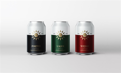
In terms of color matching, the colors are closely integrated with other design elements: the beer can is divided into two parts by the virtual horizon of the golden sun in the middle, with white above and the main color representing different tastes below.
White contrasts with black, green, and red respectively, making the beer cans have a strong visual effect. The three main colors use a unified tone to create color continuity for the brand.
BOYAJIAN olive oil
This is an olive oil rebranding project, compared with ordinary seasoning brands, the BOYAJIAN brand spares no effort to create more unique and innovative products.
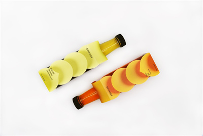
The new packaging changes the original traditional and conservative label into a colorful and modern design. The side-opening packaging adopts bright gradient colors, which correspond to the colors of the raw materials of the product (yellow is mustard sesame flavor, orange is chili oil flavor), It not only shows the beautiful color of the product itself but also complements the style of the brand.
Bright colors can not only attract more attention but also stimulate customers' enthusiasm for cooking.
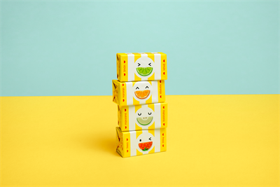
FRUNA Gummy
FRUNA is a long-established and extremely popular fudge brand in Peru. Considering its history, the designer redesigned the packaging in the style of the 1980s.
MIRAGE Arabic coffee
Everyone can find their favorite coffee taste in MIRAGE Arabica - espresso, cappuccino, mocha, latte, Americano, etc.
The design team created smart, bright, and impressive packaging for this brand. They render Arabic culture with fonts, rhombuses, windows, and colors.
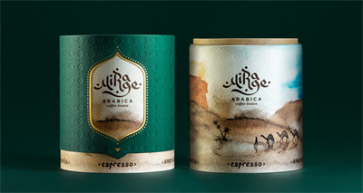
They use color to subtly connect the imagery: the blue sky represents water, the brown desert represents chocolate, the white plume clouds represent milk, and the light brown dense clouds represent milk foam. The different combinations of these raw materials are just mixed with the coffee of different flavors.
LIBERTÉ ORGANIC STANDMTL Dairy Products
This brand offers a wide variety of high-quality dairy products and is very popular in Canada. Its products are known for their purity, consistency, and great taste.
The theme of the design is simplicity and eternity. A simple circle is used as the visual center, and the brand name is placed in it, and high-brightness, low-saturation blue, green, and purple are used as the symbolic colors of different tastes so that consumers can enjoy Among the dazzling array of products, the brand, and taste can be quickly identified.
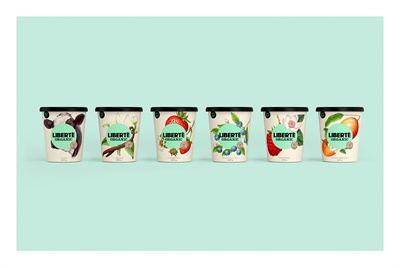
In addition, the packaging uses cream as the base color, which reflects the organic, rich, and delicious feeling of the product. The whole design is simple, beautiful, elegant, well-proportioned, and friendly.
As one of the key elements of product design language (shape, color, character, quality, structure), color always affects the product.
For example, when we talk about Coca-Cola, red comes to mind, when it comes to Starbucks, green comes to mind, and McDonald's is the classic red and yellow combination.
This is to affect the brand and spread the brand through color.
Parts of cases and pictures from Packagingoftheworld