Contact Us

Contact Us

Guangzhou Huaisheng Packaging Co.,Ltd.
We provide customers with quality products and provide high-quality services.
If you would like to leave us a comment please go to contact us
+86-18122240089


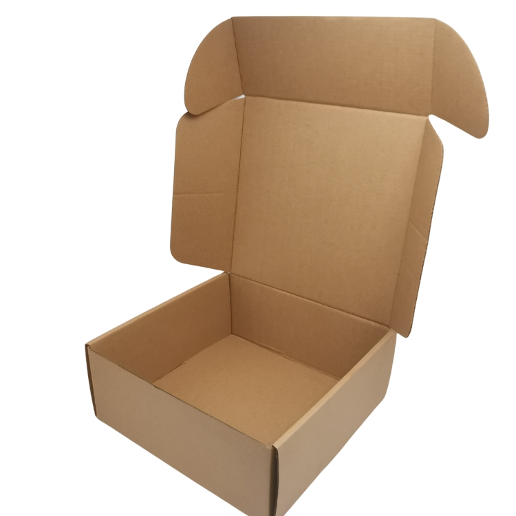
Kraft paper packaging occupies a specific niche: brands choose it not because it is the cheapest option, but because the natural, uncoated finish communicates a specific set of values — simplicity, craft, and a lighter environmental footprint — that a bright white coated box cannot. Sourcing kraft packaging well means understanding how this material behaves differently from coated board in printing, durability, and cost.
This article is written for brands positioning around natural or minimalist branding, food and beverage companies, and retailers wanting a consistent kraft-based packaging line across multiple SKUs.
The first problem is assuming kraft board prints exactly like coated stock, when in fact the natural brown base color shifts how inks appear — light colors can look muted, and full-color photographic printing is harder to reproduce accurately on uncoated kraft. The second problem is underestimating that kraft board typically has a lower stiffness-to-weight ratio than SBS coated board, which can affect structural choices for heavier products.
Buyers also frequently discover that "kraft" covers a range of shades and textures — from smooth natural kraft to heavily textured recycled kraft — and that samples from different suppliers can look meaningfully different even when both are labeled the same way.
The target buyer includes brands with a natural, artisanal, or minimalist visual identity, food and beverage companies where kraft reinforces a "simple ingredients" message, and retailers wanting one consistent packaging series across a product range rather than fully custom boxes per SKU. Each buyer should confirm whether their branding requires a smooth or textured kraft finish, since this affects both look and print quality.
Because kraft packaging is often chosen as a visual system across a whole product line rather than a single SKU, buyers should plan the series structure (consistent sizes, consistent finish) from the start rather than designing each box independently.
Before sampling, buyers should confirm kraft grade and shade (natural, recycled, or bleached kraft), GSM or board thickness, ink type (standard process inks versus inks formulated for uncoated stock), and whether any spot color or white underprinting is needed to make lighter colors show clearly against the brown base. These parameters directly affect whether the final print matches the design proof.
A complete RFQ should include reference images or Pantone codes, target order volume across the series, and whether structural consistency (same dieline, different print) is required across multiple SKUs. Buyers should request a physical print sample on the actual kraft stock before approving full-color artwork.
Artwork for kraft packaging should be designed with the brown base color in mind from the start, rather than adapting a design created for white coated stock. White or light-colored elements often need a white ink underprint to appear clearly, which is an additional production step buyers should budget for.
For a multi-SKU kraft series, standardizing the dieline across sizes where possible reduces tooling cost, while varying only the print artwork per SKU keeps the visual system consistent and simplifies reordering for individual products within the range.
The following internal links can be used inside the article body or at the end of the article to guide visitors toward relevant product pages:
Buyers should request a physical proof printed on the actual kraft stock being used for production, not a digital mockup, since color reproduction on uncoated kraft is one of the most common sources of disappointment in this category. For brands building a multi-SKU kraft series, locking a shared dieline early makes future reorders and line extensions significantly faster.
Huaisheng produces kraft packaging across multiple grades and shades, and can advise on ink and underprinting choices to help a design translate accurately onto natural board. We recommend a physical print sample for any design with light colors or fine detail before committing to bulk production.
It can, but colors — especially light or pastel tones — may need white ink underprinting to appear clearly against the natural brown base.
Kraft board generally has a lower stiffness-to-weight ratio than SBS coated board, so heavier products may need a thicker kraft grade or reinforced structure.
Yes, standardizing the structural dieline while varying only the printed artwork is a common way to keep a multi-SKU kraft series cost-efficient and visually consistent.
Sourcing kraft paper box packaging well means designing for the material's natural base color and structural properties from the start, rather than treating it as a drop-in substitute for coated board. Buyers who request physical print samples and plan a consistent structure across a product series get packaging that reinforces their brand's natural positioning without unexpected print or durability issues. The recommended next step is sharing your product range and design references for a kraft grade and structure recommendation.